With the increasing number of mobile users, having a responsive website is no longer optional—it's essential. A website that adapts to different screen sizes improves user experience, boosts SEO rankings, and enhances conversion rates.
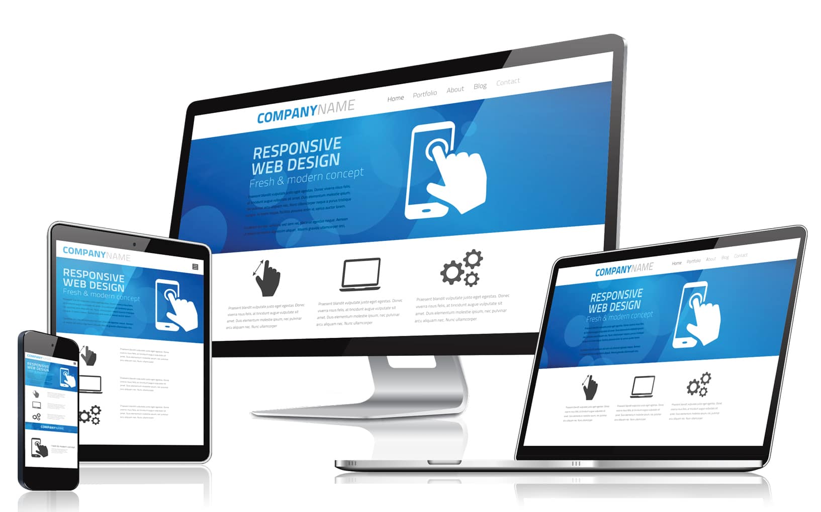
1. What is Responsive Web Design?
Responsive web design ensures that a website adjusts seamlessly to various screen sizes, providing an optimal viewing experience. It uses flexible layouts, fluid grids, and media queries to adapt content dynamically.
2. Why is Responsive Design Important?
- Improved User Experience: Visitors can navigate easily on any device without zooming or scrolling excessively.
- Higher Search Engine Rankings: Google favors mobile-friendly websites, improving visibility on search results.
- Increased Conversions: A seamless browsing experience boosts engagement and leads to higher conversion rates.
- Cost-Effective Maintenance: Instead of managing multiple versions of a website, one responsive site saves time and resources.
3. Key Elements of a Responsive Website
- Flexible Layouts: Designs that adjust dynamically to different screen sizes.
- Fluid Images: Scalable images that resize without losing quality.
- Media Queries: CSS techniques that apply styles based on device width.
- Mobile-Friendly Navigation: Easy-to-use menus and buttons for smaller screens.
4. How Responsive Design Affects SEO
Google prioritizes mobile-first indexing, meaning it primarily uses the mobile version of your site for ranking. A responsive website helps improve SEO by:
- Providing a better user experience, reducing bounce rates.
- Ensuring fast loading times, which is crucial for rankings.
- Eliminating duplicate content issues from separate mobile sites.
5. Best Practices for Implementing Responsive Design
- Use a mobile-first approach when designing your website.
- Optimize images and media for fast loading speeds.
- Ensure buttons and links are easy to tap on touchscreens.
- Test your website on multiple devices to ensure a seamless experience.
- Utilize a responsive framework like Bootstrap to streamline development.
- Enable lazy loading for images to improve site speed.
6. Common Mistakes to Avoid
- Ignoring mobile optimization and assuming desktop design will work on mobile.
- Using fixed-width elements that don’t scale with different screen sizes.
- Failing to test the site on real devices and relying only on browser resizing.
- Not optimizing images, leading to slow page load times.
- Overcomplicating navigation, making it difficult for mobile users to find information.
7. Future Trends in Responsive Web Design
As technology evolves, responsive web design continues to adapt. Some upcoming trends include:
- AI-driven design: Automating the responsive process for enhanced user experiences.
- Voice search optimization: Ensuring sites are accessible via voice commands.
- Dark mode support: Offering alternative color schemes for better readability.
- 5G-enhanced experiences: Leveraging faster internet speeds for richer media content.
Final Thoughts
A responsive website is crucial for success in today’s digital landscape. It enhances user experience, boosts SEO performance, and ensures your business stays competitive. Investing in a responsive design now will help future-proof your online presence.
Need help making your website responsive? Contact us today for expert web design solutions!